Troubleshooting pre-press
Nigel Milne Jewellery
Often, artwork and pre-press issues come at the same time! We are always around to lend a hand if something doesn’t seem to print correctly. We can advise you, just like we did for Nigel Milne Jewellery. In the end, we took the whole project on. Read our journey below.

Fixing the Problem
Even the simplest of projects can be quite technical and fiddly. Artwork and pre-press issues show up in print and can be very difficult to deal with, at this late stage.
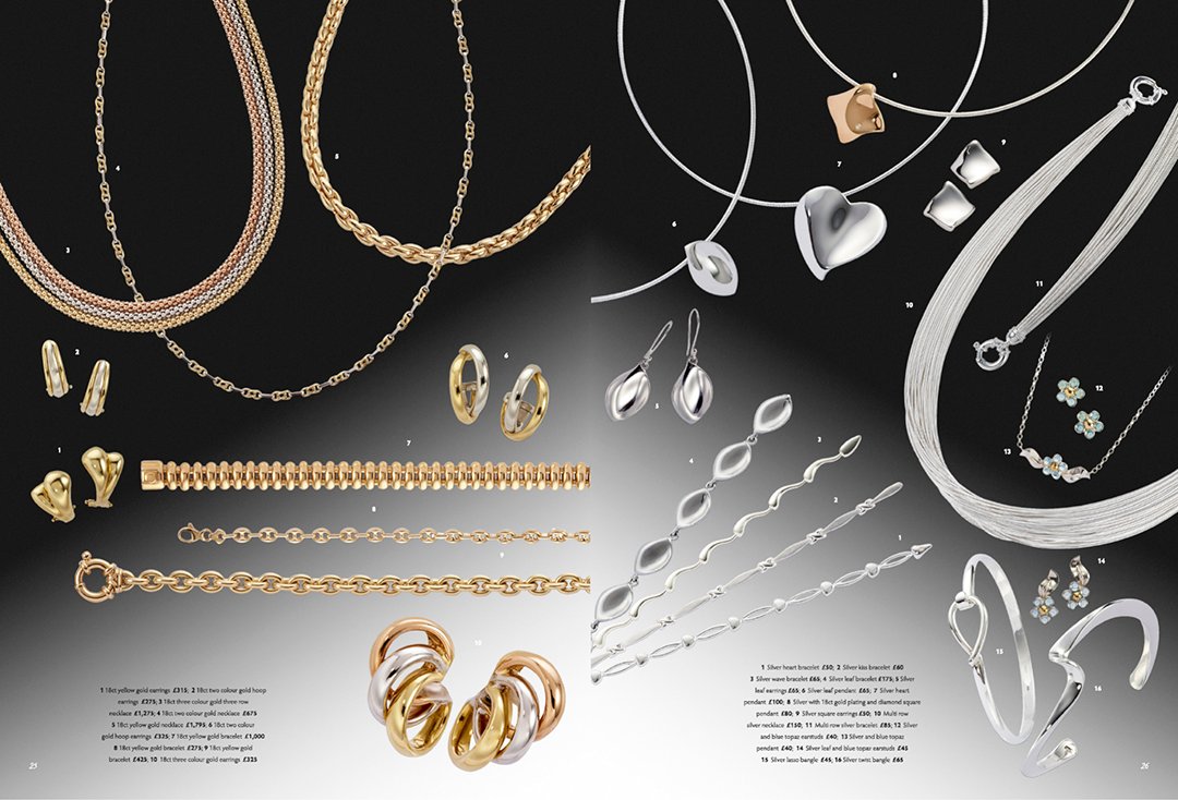
This jewellery brochure was originally designed and colour-matched by a different firm. On press, the printer could not get a result that looked like the supplied proofs, so they asked us to step in and fix the images.
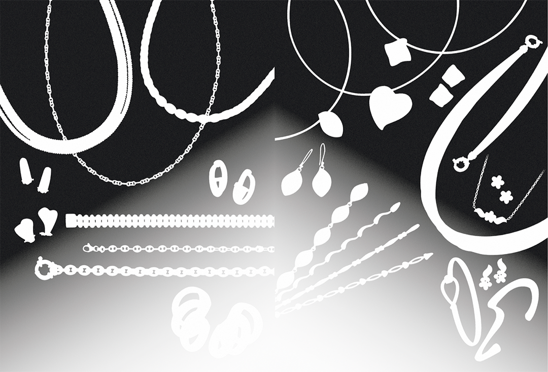
On inspection, we noticed that the original team putting the brochure together had not only used the wrong specification (profile) for the PDFs but had also converted the images using a GCR-based profile. This meant there was a fuller range in black ink throughout the jewellery. The printer was therefore not able to control the background without it affecting the shape and contrast of the products.
Advice
We advised that the background gradients be best produced as a 5th Pantone spot (426c). This would give the printer complete control over the printing. Allowing him to separate the jewellery from the gradients. We also separated the black and white text as individual PDFs, adding them on later on.
What we did
We had to separate all the text and background from the images before retouching and recreating the noisy gradients. This was done to ensure there was no banding. We also made the gradients finely trap into the jewellery using 30% of each pixel shade. This helped the printer register the 5th colour, leaving no visual issues for the customer.
The production of these images did take a lot of time and careful effort. We cut out all the jewellery from the existing four-clour gradient. We removed all evidence of it being there. Sometimes, this means retouching and rebuilding very small areas of jewellery.
Whilst we were working on the files the commissioning agent asked us to colour-correct the jewellery and supplied a few samples for us to match towards. We recombined all the elements together to form a 5 colour PDF for the printer.
The result was a job that printed well and that the client was thrilled with!
The three image slider below shows the flattened CMYK Images, the overprinting spot colour and the final result with the text from the PDF