Artinsite – 18m London Frieze – Image Composition
02/10/2020This is probably one of the most interesting and challenging friezes we have had the pleasure to work on. This huge composite image of London was a brilliant challenge. Read the full story of our work with Art in Site and large format panels, created for a variety of NHS Trusts, here.
Composition
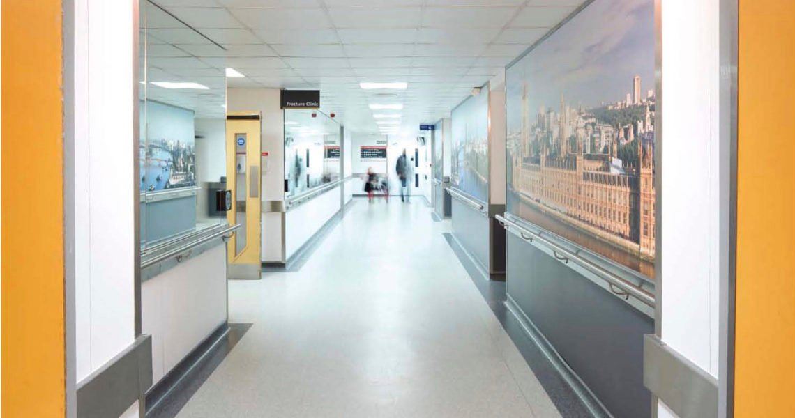
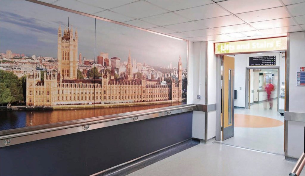
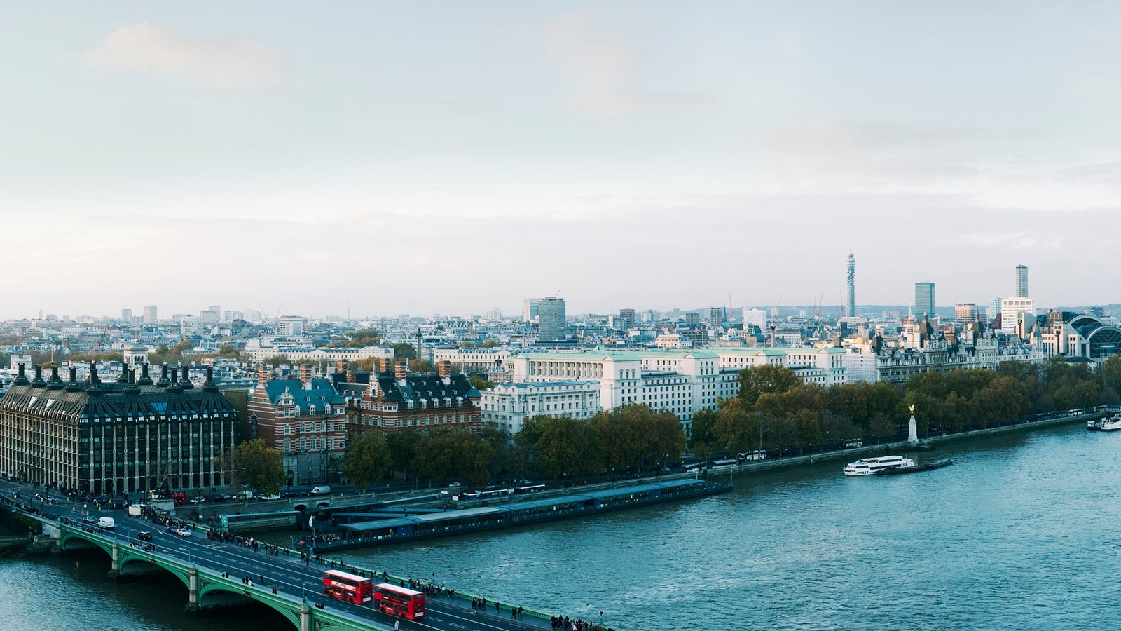
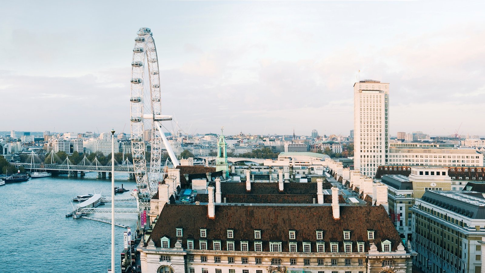
This Art in Site project for St Thomas’ Hospital was composed of 53 individual shots taken from the top of the hospital. We stitched them together to create a panorama of much of central London. The resulting image composition, final print measures 18 meters in length – the length of two buses! However, it was mounted at St Thomas’.

With the public able to press their nose right up against this image composition and scrutinise the picture closely, each join had to be pixel-perfect. As a result, this process took over 6o hours of retouching to complete. The final print-ready file was a monster 3gb in size.
Photography
Working in windy conditions in a roof-top for any job is difficult, but photographer Ed Webb did some meticulous pre-planning and overcame many challenges to deliver superb imagery to work with.
From a super zoomed-in retouching point of view, even the slightest movement of the mounted camera was detectable. We removed any camera-shake and all of the 53 shots required lens distortion correction.
We balanced the depth of field and graded the colour in the seams. The timelapse images had movement in them we didn’t want (people, cars, buses). Consequently, we removed or replaced these elements
The result was a piece of panoramic perfection. A first-class image composition. It was then printed on to fire-rated self-adhesive vinyl by large format printer McKenzie Clark using a Durst 320. A hard-wearing, deep crystal laminate was added and the prints were wrapmounted on to 12mm-thick, fire-rated MDF.

Click through – or drag on mobile – for the full frieze.
Photographer: Ed Webb | Client: Artinsite | Retouching: Bill Greenwood
Read an article published in PrintWeek about this project. Enlarge the text with the + button. Click the hand tool in the double-chevon menu to drag across the page.
See more of our image composition work with Art in Site here.


